Sunday, November 28, 2010

Dangerous Design

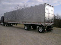
Every driver, if they have driven on the highway more than once, has undoubtedly been faced with a dangerous design.   It is one that is sometimes can be anticipated, but if it isn’t and hits a driver unexpectedly (like it often does), it can be deadly.   The design to which I am referring is the semi-trucks that pull trailers with stainless steel surfaces.  

Stainless steel is a strong metal, perfect when making trailers that are to be used for supporting and carrying large loads.  Furthermore, it is easy to clean out; therefore, it is often used when fabricating tank trailers that carry liquid.  

Design-wise, a stainless steel surface is generally visually appealing and implies cleanliness.  As a further bonus to having a stainless steel surfaced trailer, it is also easier and less expensive in production to not have to paint or apply another surface on top of the steel which it is already made out of.  For companies, it’s more efficient financially and the quantity sold is the same either way, so there is little incentive to spend money and time on paint. It is obvious why stainless steel is often a big design element when making semi-truck trailers to carry cargo.  

These surfaces, however, are some of semi-trucks biggest design flaws.  When driving down the highway at any point in the day, but especially as the sun is rising and setting, the glare that presents itself from the surface of the trailers can be and often is completely blinding.  Of course this wasn’t an intentional consequence, but it is a consequence of a lack of common sense that could easily be corrected. Having drivers on the highway unable to see is the most ridiculous danger because it is one of the easiest things to fix.  A simple coat of paint or a canvas cover would make all the difference.  

The danger is a result of its large scale.  Normally cars have just their bumpers in such a reflective metal.  With these trailers, though, whether it’s the entire trailer or just the back doors, it is a threat to drivers because the glare is much bigger and more difficult to avoid.

It is one thing to have a stainless steel bumper like many cars and trucks, but to have the entire trailer be stainless steel is unnecessary and dangerous.  That’s all there is to it.

Design in Society: Utopian Design

A utopian design that is becoming increasingly popular worldwide are wind turbines, and for good reasons.  Using wind turbines as an electricity source has many benefits.  Among the most important for society include the facts that wind turbines don’t require fresh water (unlike irrigation and thermal electric generation which account for approximately 77% of the U.S. fresh water use according to the U.S. Department of Energy).  Second, wind energy is inexhaustible and infinitely renewable.  Third, wind energy is a clean energy that produces no emissions.  Next, because the fuel (wind) is free, the gas demand is reduced and gas price hikes are therefore limited.  Furthermore, they take up less land than solar panels or other energy plants do.  Finally it can be used in a variety of applications to power homes, businesses, farms, and ranches.  


When a technology is as innovative as wind turbines, it is no wonder why new designs are always emerging, which is exactly what occurred late in the summer of 2010.  Last August, a British Consortium unveiled “the Nova vertical axis wind turbine (VAWT) and the Aerogenerator X,” “two radical V-shaped wind turbine designs that are lighter, more stable, easier to maintain and generate more power than current generations.”  According to the article in The Irish Times, “V-shaped turbines operate at a lower height and do not encounter the same problems as the current generation-  known as horizontal axis wind turbines (HAWTs)-  because of their size and height, especially in gale force winds.”  “Designed for offshore deployment, VAWTs are also able to harness the wind from any direction and do not require mechanisms that ensure they’re always facing the wind.”   


This design is not without problems and it will likely be several years before full scale prototypes are ready to be mass produced, but the interest in creativity by the designers, and the interest in the project by the people is encouraging.

Such designs do nothing but strive to improve society.  The universal use of wind energy would reduce the consequences of society’s dependence on energy.  No longer would we have to worry about energy plants polluting our air and water, or running out of fuel, or driving prices for fuels and electricity higher and higher. 

It is clear the future is in wind.

Saturday, November 27, 2010

Color Transforms

Color transforms any design, whether for the good or bad, depending on the message or mood that is trying to be portrayed.    There have been times when the lack of color seems more fitting than the addition of color- when color would have brought a design to a different and unfitting place. Usually, however, color is a welcome and powerful addition to a design- one that adds more and portrays and emotion or mood better than any other design element could.  

One of my favorite examples of how color transforms for the good is during the Christmas season, when house after house twinkles with holiday cheer and warmth due to a simple addition of color through lights and decor.   Color has the power to transform moods and transport people, especially during the holidays.

When looking at homes, there are so many different types of architecture that very few homes are designed exactly the same.  Furthermore, some homes are new, some expensive, some run down, others historical.  Eleven months out of the year, these houses may have nothing in common, but that one month, entire blocks are lit up with color and light and they all look cohesive -alike somehow.  The color is the element of the decorations and the holiday lights that undeniably contributes the most to the transformation. 

Also, each house has its own style, and the way one decorates can say a lot about the person that lives there.  Even the quantity and the color of the Christmas lights one chooses sets a mood and can change the entire feel of a home’s exterior, revealing if the homeowner is playful or more refined.    When it comes to Christmas lights, the most common colors are white strands, or a colorful mixture of primary (red, yellow, and blue) and secondary colors (orange, green, and violet), but sometimes people throw tradition out the window and make their house pink.  It doesn’t really matter, either way color is transforming a home from ordinary to special to the person who lives there.


Image above (left) and two below from http://www.funny-potato.com/christmas-lights.html
Image above (right) from 


Furthermore, each color looks different when it is placed amongst the array of other colors: sometimes it appears more vivid, sometimes dimmer, an element that allows for so many colors to be mixed and still being aesthetically appealing.  

Passing by a home covered in colorful lights and wreaths makes me feel warm inside, it doesn’t matter whether they are warm colors (red, orange, and yellow) or cool colors (green, blue, and violet). 

It is hard to explain in its entirety the feeling one gets when they see a neighborhood transformed, but it can be emotional- the fact that color can be so immensely powerful.  Color like this can truly transform the design and feel of any home.

Monday, November 15, 2010

A Marketable Design: Foldable Flats

Image from http://www.thestylishchick.com/blog/deal-of-the-day/


Flats are always a welcome relief after a long day of wearing heels.  Recently, however, it seems the amount of brands that make "foldable flats" and the amount of stores selling them is increasing, indicating their popularity is growing.  This made me ask myself, what about "foldable flats" makes them so popular?  Most flats are pretty small as it is, is it necessary for them to be foldable?
Upon closer examination, however, it became apparent that some clever design elements that make them easily marketable were behind such growth.  

The two main elements of design in these "foldable flats" are their styles and scale.  They come in many colors and patterns, are light weight, and can be rolled up and stashed away in a pocket or purse easily.  Furthermore, each brand advertises a unique design feature.  For example, "Dr Scholl's For Her Fast Flats Foldable Black Flats with Stylish Wristlet" is made with the Dr Scholl's cushioning that is supposed to soothe sore feet, while "Fit in Clouds" brand come in 3 different designs (silver sequin, royal gold, and black patent) and advertise that they "are wearable outside and can be reused over and over again."
The different styles, specifically, provide an avenue to reach a versatile market of buyers because they provide for different types of women.    The wearer gets the choice about whether they want to emphasize their flats with a patterned shoe, or if they want to create unity in their outfit (through repetition of colors) and have their flats be discreet.  This undoubtedly contributes to their popularity.
Their scale which is the other major design element present here, allow them to be conveniently tucked away until they are needed.  Due to the need for "smaller scale", however, most of them only come in limited sizes which is unfortunate and may force them to miss out on a number of potential customers.  Despite this fact, their small size and ability to easily fit into small pockets or bags remains a major selling feature and a main contributor to their continued growth in popularity, so seeing as it is obviously not hurting their sales, it is unlikely this will change in the near future.  One drawback of the smaller scale is that it requires thinner fabric and soles meaning they are likely less durable, but for women that don't expect to use them over and over, this is not a problem.
The fact is that though these "foldable flats" aren't necessary, they are convenient for the occasional night out.  This alone seems to be the element that is the most responsible for their success.

Sunday, November 14, 2010

Ergonomic Design

This past weekend, I spent more time than usual in my father's work truck and came to some new realizations.  It is a 2005 GMC Sierra 2500 pickup - nothing that I have ever thought of as special, but with the five areas of ergonomic research on my mind, I examined its design more closely than I ever have before. I concluded that, though I don't believe there is such thing as a perfect design, there is such thing as a successful design, and this particular GMC is a successful ergonomic design.
In the first area of ergonomic research, safety, this GMC has many features that just make sense, yet are not standard in every vehicle.  In addition to the safety measures that are now standard in all new vehicles such as seatbelts and airbags, simple things like the window controllers having to be pulled up rather than pressed to roll the window up contribute to this truck's safety.  This feature prevents children or animals from rolling the window up on themselves with their knees or paws when they have their head out the window.  Whether we want to admit it or not, such issues do come up.  Secondly, the radio can be controlled by buttons on the steering wheel.  This means a person can adjust the volume or station without removing their hands from the wheel.  As we all know, it only takes looking away for a second for an accident to occur.  Next, the headlights turn on by themselves when it detects it is getting dark or foggy.  This means that the driver doesn't have to worry about forgetting to turn on their headlights to be seen by other drivers or to be able to see what is in front of them in all conditions. The headlights will be on when they need to be, something that makes driving safer for everyone. Furthermore, the driver cannot be locked out of the car while the keys are in the ignition because the truck doors will not lock.  They work automatically, however, when they should.  For example, when the truck is put into gear, the doors lock.  When it is put into park, they unlock.  These features provide for a sense of security as a driver that one's passengers are secure while the car is in motion.  Additionally, visor extensions on the sun visors provide for extra protection against driving into the sun, improving the driver's ability to see and thus chances of driving safely.  All these features seem simple and logical to me, but strangely, many newer vehicles (such as our family's 2006 Dodge Ram) do not have any of them.
In the field of comfort,  there is little I would change about the interior, something I don't say often.  The seats are comfortable and padded well.  The head rests are soft and adjustable in order to fit every passenger correctly.  The truck also has a powerful air conditioning and heating system that actually circulates air to the back seat where there aren't any vents. It also conveniently displays the temperature outside on the rear view mirror and the artist and song playing on the radio on the dash. 
This truck is also very easy to use.  The gas and brake petals are sensitive enough that it is easy to stop and get going without much effort.  Since, as I said above, the lights go on automatically, there is one less thing to think about adjusting before starting the car.  The same element that makes the radio safe also makes it convenient because it takes very little effort to make adjustments on the steering wheel.  The settings for cruise control are conveniently located right next to the wheel, and the seats and steering column are easy to adjust to fit any driver.  This means that once they are comfortable, there is little to think about other than driving the car safely.
In  terms of performance, the truck has presented no issues.  After five years of use, none of the parts or features have broken yet.  It not only holds up to normal wear and tear, but it also has not wavered in the face of having to carry the weight of equipment. The engine has presented no problems and , though it has gone through a few transmissions in its short life, there is little to complain about.   It performs when it is asked to and gets my father from point A to point B; little more than that can be expected.
Aesthetics is the last and least important area or ergonomic  research, but it is one in which this truck does not fall short.  The body is smooth with rounded edges making it automatically register as more aerodynamic and visually appealing.  Its silver bumper is emphasized by the contrast in colors from the dark blue body.  The silver strip along both sides of the truck gives it a feeling of unity because of the continuity of the silver line that flows from bumper to bumper. and the proximity of the silver to the other silver elements in the wheels. Everything is slightly larger in scale than it would be on a car to look proportional on the larger truck. The grill seems to be the focal point of the front for a few reasons.  First, it is in the middle of the two headlights that draw one's eyes.  It also is black which presents contrast from the silver and blue that are the two main hues.   Finally, the red GMC logo that is present in the center of the black automatically draw one's eye to the grill.

All five areas of ergonomic  research have led me to only one conclusion.  That, though no design is perfect, this truck's design was indeed successful because it serves its purpose and caters to the user well.

Monday, November 8, 2010

A Warm Emergency Center

Hazel Hawkins Hospital in Hollister, CA unveiled their most recent addition this past weekend in an open house for the public: a brand new state-of-the-art Emergency Department.  As I wandered through, however, I couldn’t help but notice the design was unlike any hospital facility I have personally ever been to; it was actually semi-warm feeling.  Though I doubt anyone will take notice once the hospital facility is being used for its intended purpose and people’s loved ones are brought there for care, before it is open for use, it is easy to take notice of the attention that was put in to making the department a comfortable place to work and utilize.    

Image from http://www.hazelhawkins.com/measure-l.htm

The facility boasts of many new features, including “18 total beds which includes seven private treatment rooms, three state-of-the-art trauma bays, four negative pressure treatment rooms (one of which will be an isolation room), and a four-bed “fast track” area to speed up service for people who come in with non-life threatening conditions. The ER will also have a technologically advanced imaging room, and decontamination room. A large, comfortable nicely appointed waiting area for family members will also be an asset to the ER.”

The waiting room I found to be adequate but it was nothing special compared to the rest if the building.  Its architecture was designed to be cohesive with the existing hospital meaning it would too have glass block walls in the corners of the building making it light in the nurses’ lounge and the conference room.    Its 18 rooms are painted with warm colors, unlike the stark walls that are usually present in hospital facilities.  There is plenty of privacy, even though each room has a sliding glass door, because each door has a curtain that can be pulled that covers the glass. Also the glass will be more sound proof than normal emergency rooms that only have curtains alone separating patients making providing privacy easier.   The layout makes it seem spacey because the ER is set up so that one hallway can be followed all the way around the facility making it much easier for a flow to be maintained.  The doctors’ sleeping rooms and offices are also understated and nicely done.  

Though I hope to never require their services, it is comforting to know that there is a state-of-the-art and, though the very words are contradictory, well-designed hospital facility in my home town.

Brian Fies Talks Words and Images

Last week, my Des001 class and I had the privilege of hearing a guest lecture done by Brian Fies, the author and illustrator of Mom’s Cancer and Whatever Happened to the World of Tomorrow?.  


Left Image from 
Copyright Brian Fies


Right Image from
                                                          Copyright Brian Fies


Both books provide personal insights into the person Brian Fies is, but his lecture gave us some powerful insights into the artist he is, his creative process, and why comics is his medium of choice.  I truly enjoyed his lecture.  He was open to questions and honest and about where in his books he felt he may have succeeded or failed.  Plus, it is always nice to hear the perspective of someone in a creative field because that is where we all hope to be someday.     

He spoke about many different topics, but specifically regarding the topic of the relationship between words and images, he had a lot to say, implying this was one of the most important considerations in his comics.  After briefly explaining his books, one of the first things he went into is the obvious question, why comics? In the words of Brian Fies, “Comics are a combination of words and pictures that add up to more than the sum of their parts,” meaning both words and images are infinitely better when used together than when used separately. He also said comics were what he chose partly because, “the language of comics allowed him to do things that other media wouldn’t.”  For example, it allowed him to use “hard-hitting metaphors” in Mom's Cancer such as being able to draw his mother as the character in the board game Operation, but as “inoperable”.  Another example was the illustration of his mother walking a tightrope as a metaphor for her life being a constant balancing act.  Just when she would think had something figured out, something else would come along to throw her off again. With this metaphor he was able to having a serious discussion in text about his mother’s struggles with balancing medication, but still allow the image of his mother walking a tightrope to be playful.  Furthermore, comics can manipulate space and time like few other mediums can.  


Image from
http://www.guardian.co.uk/science/blog/2010/jul/14/medical-comics-patients

The language of comics being the combination of words and images also gave him the freedom to be able to show one thing in pictures and put another in text.  An example Fies pointed out was the image of Frankenstein’s laboratory in Mom's Cancer being an obvious enough reference that it didn’t even need to be mentioned in the text.  He was free to put in the text whatever he wished.

The relationship between words and images and the different ways it can be used was obviously one of the biggest and most thought-out aspects of Fies’ books.  In Fies’ comics, and all comics, it is now even more clear that neither words nor images completely tell a story without the other. 


Words and Images: A Powerful Pair

Words and images together are often thought of as compliments.  Like peanut butter and jelly, they make a wonderful and often utilized pair.  This is because words and images together can take many forms and have many uses.  Most commonly, however, their simplest form is utilized by authors, artists, and designers alike, and words and images work together to create a balance and convey a message.  Just look around, it is easy to see this relationship in action.

Words and images have been put together since the beginning of the written word.  Generally, either words are included to explain an image, or words are further explained with the aid of a corresponding picture.  Either way, this relationship is natural and easy to grasp.  In childrens’ picture books, for example, the child follows a story by looking at pictures and listening to someone read the words on the page further explaining what was illustrated.  The better the illustrations, the less words are required to explain the storyline.  The below story (Mommy’s High Heel Shoes, written by Kristie Finnan and illustrated by Pat Achilles) for example, requires a limited amount of words to explain the story thoroughly because the illustrations are so vivid and self-explanatory.  

Color and line is used to accentuate the high heels that are the main subject of the little girl’s affection by making the color bright, leading one’s eyes right to them, and by clearly displaying a relationship between the shoes and the girl by giving her the same color dress as the shoes her mother wears. 


In contrast, when words are the dominant feature, like in textbooks, charts and images can be placed alongside to give visual demonstrations and simplify an otherwise complicated and extensive list of words. Just the same as if an image or graph is the complicated part and many words may be required to explain.


As one aspect is stronger, the other doesn’t have to work as hard to explain or illustrate.  That is perhaps the most important aspect of their relationship.  One must know when to let an image do the talking or add a written explanation.  The same goes for books with few pictures.  If the writing is powerful and clear enough, it can stand alone.  

For any designer, being able to recognize the right combination of words and images can be a powerful tool.


Monday, November 1, 2010

An Uncomfortable Design Flaw

Anyone who has been to the Aggie Stadium at U.C. Davis knows that it is a fairly well-designed stadium; enough seating and concessions, no obstructed views, contoured seats which make the regular bleacher seats more comfortable for the duration of a three hour game.  What my family and I found out, however, at this past weekend’s football game is that there is something that the designers did not sufficiently plan for.  These bleachers may work wonderfully in the sunshine and the windy and the clouds, but these bleachers and moisture don’t mix.   When it is raining the bleachers have what is, in my opinion, a simply fixed, yet huge design flaw.  A flaw that I later realized almost every bleacher design has.

The contoured surface, though comfortable in nice weather, we found quickly to be not the best idea.  The designers obviously didn’t consider what would happen when it rained.  Maybe they figured no one would use them when it was raining, who knows, but they did not plan very well for all possible circumstances which is what a good designer would do.  The water when it is raining pools in this dip and has nowhere to flow but horizontally, soaking everyone that is sitting on the bleachers.  Sitting on blankets or tarps or pads is futile because they are no match for the water trapped on the surface.  Then, even after it stops raining, the water just sits there until it is evaporated meaning the bleachers are wet for much longer than they need to be.  My question is why?


A simple solution would be to have holes drilled into the tops of the seats to drain the water.  If holes around the size of a penny (big enough for gravity to pull the water down) were placed in the dip of the surface about a foot apart, this problem would be solved.  This solution would not be expensive or all that time consuming if it had been done while the seats were being manufactured.

You may be saying if you didn’t want to get wet, maybe you shouldn’t have gone to watch a football game when rain was in the forecast.  I say, however, that it shouldn’t matter.  The people that show up to support any team and pay their hard earned money for a seat deserve to have comfortable seats in all weather conditions, don’t you think?

Industrial Design

The electric standing mixer- no commercial kitchen would be complete without one.  They are also mass-produced for sale to the millions of households in the United States and throughout the world; the most iconic being the KitchenAid®.  Often a staple of the American counter top, most kitchens have and use KitchenAids® often.  But other than for convenience, why?  People had been mixing by hand for centuries without problems; do we really need something to mix for us?  There is also the option of buying an electric hand mixer.  Why is this particular type and brand of mixer bought so often? 

I believe it has a lot to do with the product’s design.
  

Sleek in its recognizable form, it is aesthetically pleasing.  Sold in many different colors, customers are given the option to choose the one that will provide visual unity to appliances that will be in its proximity once it gets into their kitchen.  Other than the black handles, the frame and bowl is symmetrically balanced from the front view making it look stable.  From the side view it is still balanced, just asymmetrically balanced, because the stand on one side and the bowl on the other both have the same visual value and importance towards the function of the mixer.  One holds the mechanisms that make the mixer mix, the other holds what is being mixed.  The stand has a legato rhythm resulting from the curved lines and smooth surfaces that flows right into the mixing bowl of the same style.  

The scale also makes it identifiable.  Though they use mixers and bowls of varying sizes in commercial kitchens, most KitchenAid® household mixers are the same manageable scale and have a consistent bowl-to-stand proportion.  They are made to fit on top of a counter top or to fit into a cabinet in someone’s home.  This requires that as their models may be slightly altered and improved, its dimensions remain greatly dependable and uniform.

All these design elements likely contribute to its popularity.  In my opinion, the biggest factor, however, is the fact that the mixer is likely the same familiar shape and design as the one that was in one’s kitchen growing up.  Many people, including me, have fond memories of their mother or grandmother using one such mixer, so they therefore desire one of their own.  It is a reliable constant that generation after generation can enjoy because the basic design elements have remained unchanged.

Though I stand by the belief that some part of the decision-making process is probably design related, I suppose it is possible that one may buy a KitchenAid® mixer for all, any, or none of these reasons.  No matter the reason, though, it cannot be denied that the KitchenAid® standing mixer is truly an example of industrial design that has stood the test of time.


Friday, October 29, 2010

The Interaction of Content and Form in OBJECTIFIED

The film “Objectified” (2009), directed by Gary Hustwit, is an intriguing documentary about objects for a few reasons.  The two biggest being, first, because it is eye opening, but second because it is different.  Most documentaries of this sort would focus on the creators of these objects, but, though this film does feature different designers talking about their work and the processes the designers’ use to create, neither are seemingly the director’s focus.  Every word spoken by the designers and camera shot between designers, however, revolves around explaining or displaying different objects.  From this and the statements of the designers that are featured, I have concluded that it was his goal for us to be inspired to immerse ourselves in the world of objects and think about them as what their designers know them to be, carefully articulated designs - to realize that everything we see and use, in fact every contour and feature of everything we see and use, was created thoughtfully and intentionally.  


I came to conclude this for a few reasons.  The biggest one being, just like in the design of an object, the director had absolute control over the form his film was going to take.  This being true, every aspect of the film can be looked at critically and from it, the film’s purpose, or content, can be inferred.  For example, the way objects are presented, though subtle, can reveal a lot to a watchful eye.  The shots of the many objects are presented to us close up, from unique angles, and sometimes even from “open form” shots only showing parts of objects.  All of these shots create a circumstance which we have to really examine an object’s features and automatically lead us to think more deeply about what, why, and how. 


Even the objects that were not the main focus of a segment, such as the experimental materials the creators used on prototypes and such items as the computer mouse a designer used to put a design into a CAD (Computer Aided Design) program were presented in this unique way, proving that the objects are definitely the focus of the film.  Also, the way the director shifts from designer to designer, from country to country, gives a sense of designers’ impacts on objects worldwide.  Truly every aspect of the film’s form and the inferred content made Hustwit’s concept clear.  All man-made objects are designs.